Proportions
Scale the sign evenly. Do not stretch, rearrange the letters or separate the spikelets.

Pereiaslav Khlib / Digital brand book
A practical guide for the team, partners and designers.
The logo, brand colors, tagline and images are taken from the brand's existing materials. The layout rules, fonts, and tone of communication below are a suggested framework for this site and future layouts.
Discover more
The signature blue facade and subtle graphics are the basis of the new digital design.
Emphasis on large surfaces and decorative details, inspired by the store front. We use dark blue for small text.
The light background leaves room for the real product. The golden color supports the crust and butter theme.
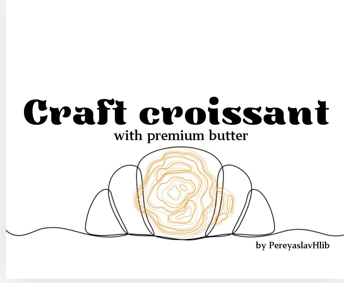
View facade · View croissant layout. The original logo retains its own colors.
"The smell of bread makes people kinder"
The brand's slogan puts the person and simple everyday experience at the center. The name links the brand to Pereyaslav; the original emblem combines a hand-drawn drawing, ears of corn, and a gold mark above the name.
We believe that bread is more than a product. It is the care of the daily table, respect for the work of bakers and the connection between generations. Trust starts with openness: we show people and production, accurately describe products and carefully answer questions.
The main sign is a brown handwritten "Pereiaslav Khlib" with golden ears. Use original files for layouts.
PNG has a transparent background. PDF is the original file from brand materials.
Scale the sign evenly. Do not stretch, rearrange the letters or separate the spikelets.
Use a light plain background. The recommended margin on each side is at least ¼ of the width of the sign.
For digital layouts, a width of 90 px or more is recommended. When printing, check the fine strokes on the test print.
Two primary colors are reproduced
from the original PNG logo.
We keep the original colors of the logo. The updated site complements them with a blue facade accent, dark blue headers and a milky background. Gold is not used for small text on a light background. We coordinate printing colors through a color test.
Headlines · Georgia
The smell of bread.
The warmth of the house.
Expressive titles, short phrases and a calm rhythm. Italics — for one semantic accent.
Text · Arial
Bread to yours
daily table.
Body text, product names, weights, contacts and navigation. The basic pin on the site is 16 px; row spacing — 1.6.
This is a suggested font pair for digital materials. The handwritten letters of the original logo remain part of the image of the mark.
The product, its texture,
packaging and people at work.
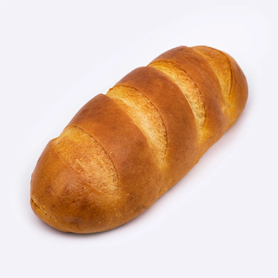
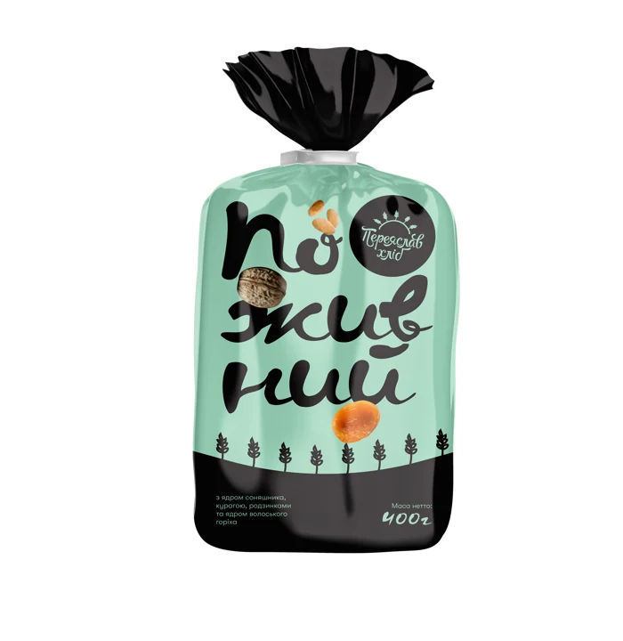
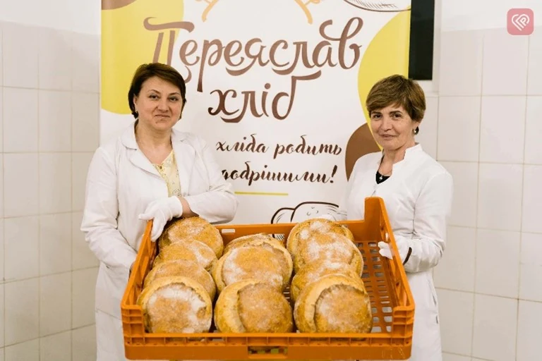
Transmit the true color of crust and crumb, preserve details and soft shadows.
For the catalog - one product or its packaging. For stories - a cut of bread, the hands of bakers, a common table and real photos of excursions and master classes. Add the date of the event and the author's signature.
The name on the photo must correspond to the product card. Label the packaging design and save photo captions.
We write as we speak to a person at the bread shelf: benevolently, concretely and with respect for his choice.
"Bread begins with people. From the attentive hands of the baker to your family table."
"Polyanytsia on sourdough, 650 g. For a family dinner and favorite sandwiches."
"Let's choose an assortment for your store. Tell us about your bread shelf."
"Behind each loaf of bread is the work of our bakers. Thank you for choosing yours."
In terms of names and characteristics, we rely on the label: exact name, weight, quantity in the package. Claims about composition, certification and special properties require up-to-date confirmation.
Original files for work and sources of facts used on the site.
Logo, 12-page catalog, product photos, packaging examples and brand description from Google Drive provided. Weights and packaging are transferred from the booklet; "Gretchy", "Greek", flour and new dairy products are added according to individual materials of the manufacturer. A separate direction is Zamoroz frozen pastries; its range and images are shown in the supplied 16-page booklet.